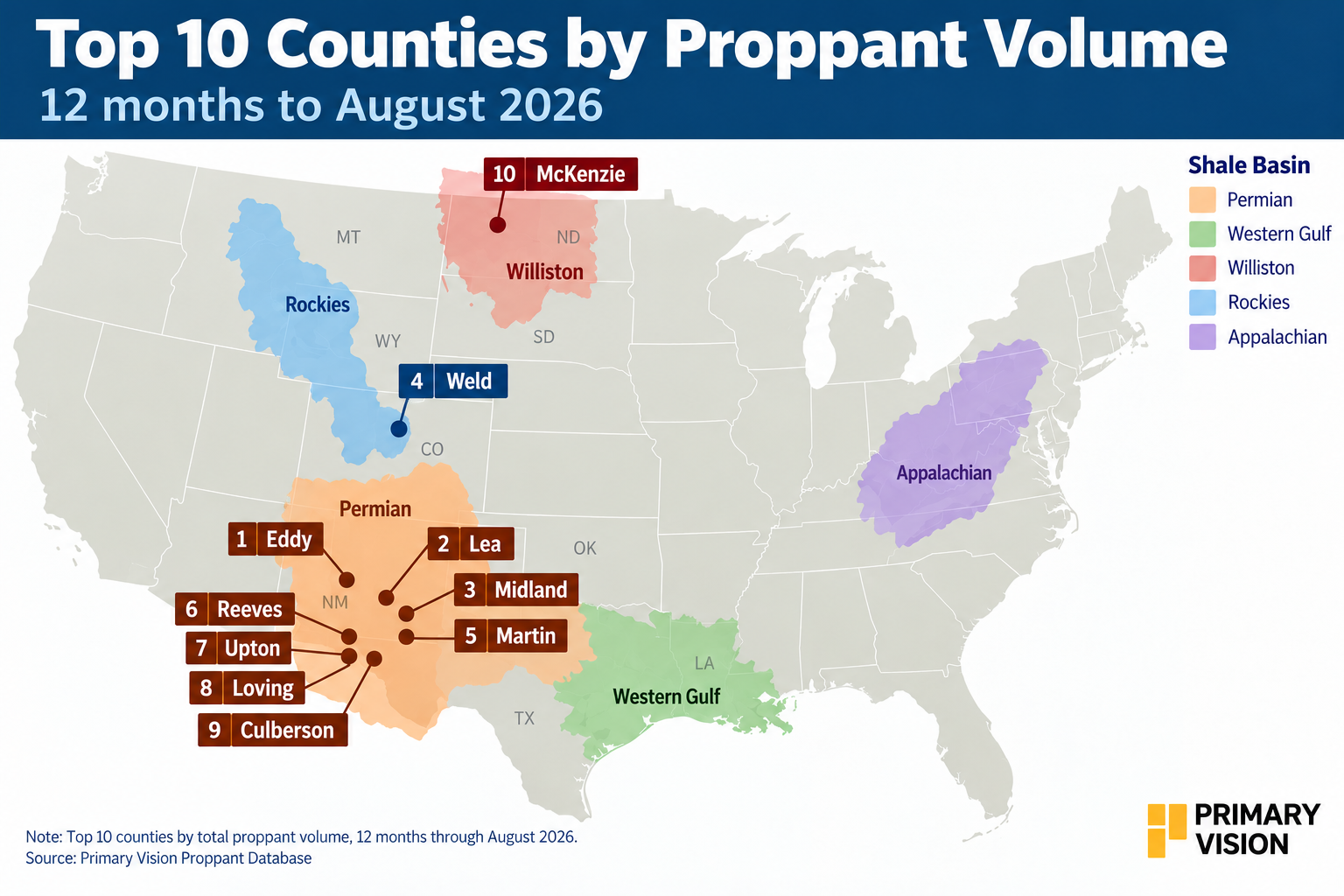
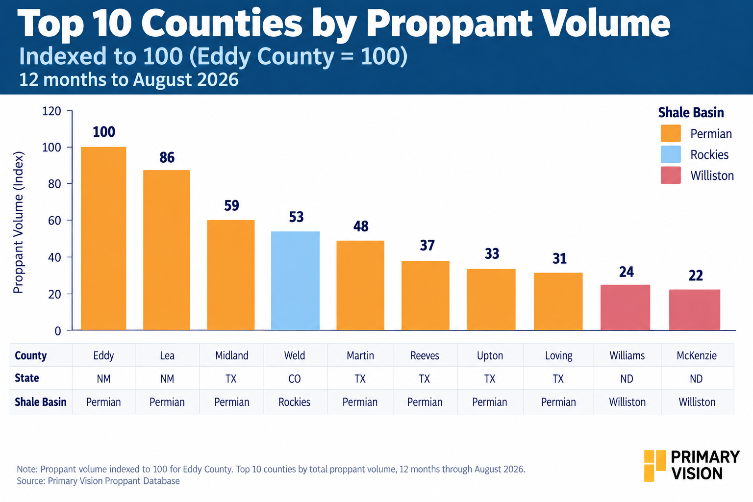
Eddy is the benchmark county in the analysis. Lea follows at 86% of Eddy's reported proppant volume, while Midland is at 59% and Martin at 48%. The concentration remains heavily weighted toward the Permian. Seven of the 10 leading counties are Permian markets.
The ranking therefore looks broadly similar to the frac-job ranking. But the differences between the two datasets provide another layer of information.
Proppant Generally Follows The Jobs
The relationship between jobs and proppant is relatively close among the leading counties. Eddy was about 17% above Lea in frac jobs, while its proppant volume was 14% lower. Midland was about 41% below Eddy in jobs and 41% lower in proppant. Martin was roughly 52% lower in jobs and 52% lower in proppant.
The relationship changes somewhat further down the ranking. Weld's frac activity was about 47% below Eddy, while its proppant volume was 47% lower. Upton was about 67% lower in jobs, with proppant at 33% of Eddy's level.
That suggests the largest counties are generally generating proppant demand in proportion to their completion activity, rather than showing a completely different ranking when measured by proppant.
Why Does Intensity Differ?
The difference between jobs and proppant can indicate how wells are being completed. Lateral length, completion design, formation characteristics, and operator development strategy can all influence the amount of proppant used per job. Two counties can therefore generate similar frac activity while producing different levels of proppant demand.
This is particularly important when evaluating oilfield-service demand. A job count tells us where work is happening. Proppant provides another indication of how much material is being consumed by that activity.
What The Data Actually Shows
The cleaned proppant data confirms the broad geographic pattern from Part 1. The Permian remains the dominant county-level market, and the leading proppant counties largely overlap with the leading frac-job counties. But the relationship is not perfectly linear. That creates a useful distinction between activity concentration and completion intensity.
Part 3 will take the analysis one step further by examining the operators behind county-level frac activity and how the competitive landscape varies across these markets.
Upgrade to Pro Today and get…
• This article — plus dozens more each month, all within our full Research Module
• Frac Hits — our National-Level Frac Spread Count and Frac Job Count, updated weekly
• Frac Operator Monitor — detailed FSC & FJC by operator
• And so much more, designed to help you track, forecast, and outperform